Showing posts with label Transparency. Show all posts

Shawl Quilt - Fabric selection

Today I'm sharing some additional tips on choosing fabrics for the Shawl quilt pattern!


In the Shawl pattern I give some tips on fabric selection, and also in the Color Hexa blog post there are tips on how to choose colour selection.  This extra blog post is not meant to overcomplicate the process, so if you're into a groove with the other resources available, then by all means, stay with what's working for you!  But, since colour selection matters to achieve the woven plaid look of the quilt, and since there are so many ways to choose colours successfully, I thought I'd mention some simple tips for any of you who would find this additional info helpful!

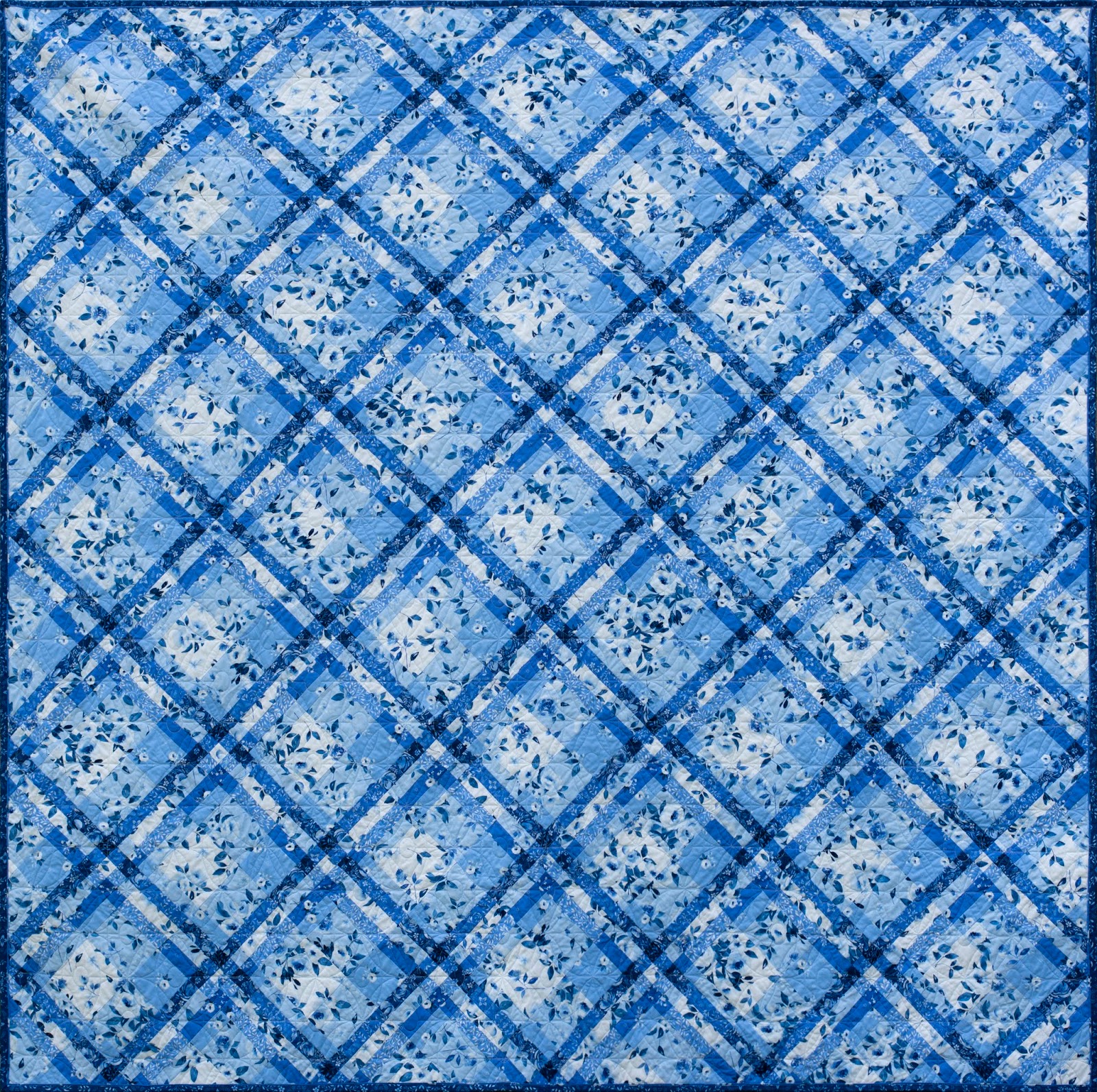
The Shawl quilt is a visual effect, where fabric can achieve the look of a woven plaid. There's a formula in the pattern that can help you choose the right colours, whether you're using prints or solids.

So far I've made this quilt three times, all in very different colour palettes; twice in prints, and once in solids.  So for the upcoming QAL, I thought I'd play with solids once again.  This quilt will be going on my youngest son's bed.  My goal is to re-do all my kids's bedding this year, and so I'm looking forward to knowing this first one will be checked off the list in a matter of weeks!

Here's my in-progress fabric palette.  I'll share my thoughts as I narrow it down to the final palette.


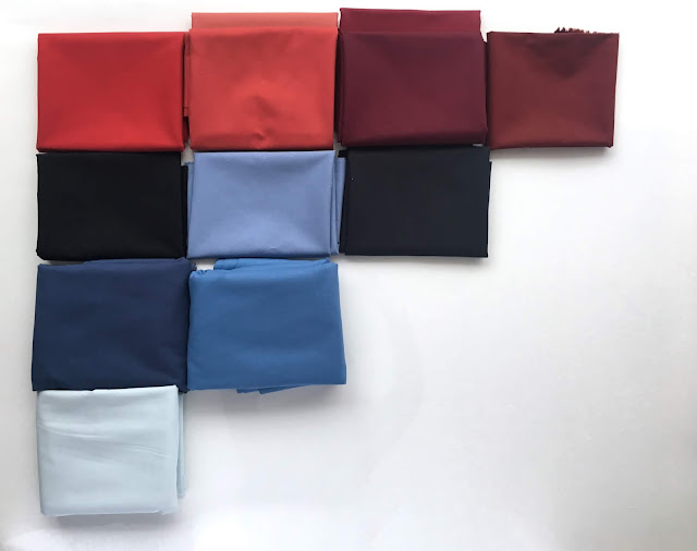
Unlike other times I've chosen a  Shawl palette, I started with a plaid that I liked the colours of.  These two Robert Kaufman plaids were my inspiration.  I didn't have the actual Robert Kaufman Mammoth Flannels on hand though, so my aim was to find a similar:
Black or charcoal,
Red,
White, and
Dark blue,
then put these plaids aside and work with the four colours to find the right interacting colours.

This time I didn't use Color Hexa, or any other digital colour blending tool, just my imagination as I auditioned different bolts of fabric in the fabric store.


I've actually ordered this one to use as a backing for either a quilt or a duvet in my boys' room, so I'm excited to have a Shawl quilt that will be inspired by these colours.

At the quilt shop I wrote the letters on a scraps of paper to mark the bolts as I chose, and one by one selected my colours.  In what felt like 45 minutes later walked out with all the fabrics I needed.  I am the slowest decision maker I've ever met, so if I can do it, so can you!

I couldn't decide between two prints for AD and BD, so I settled to just buy both since this quilt shop was 40 minutes from home, and planned to make the final decision later.

Also, AB should be lighter than AC, since B is lighter than C, so I popped into a store today and found the right blue for AC.  (Also I could have switched AB and AC and that could have done the trick, too!


Here are some recommendations for how to simplify the colour selection process:

1.  Search for a plaid that you already like the colours of, and refer to that when selecting your fabric.

2.  Usually we find it pretty easy to imagine what any given colour would look like mixed with black or white, so consider using white or black (or nearly white or black) as one or two of your first four colours.   For this quilt I chose a "nearly-white" pale grey blue for A, and a "nearly black" charcoal for C.  This made choosing blended colours easy!

3.  As mentioned in the pattern: A, B, and AB will be the most used fabrics in your quilt, so find colours for these three that you really love!

4.  Don't overcomplicate the process!  Somehow this perception of a woven plaid still works in prints, even.  Our brains are amazing at perceiving pattern and organization.  For example, don't blue and red make purple?  Yes, but I opted for burgundy/maroon in my palette for the red/blue blended colours.  Though my boys both really like purple, I didn't want to introduce yet another colour into their bedroom, so I was happy to find some burgundies that still fit.


For this blog post, I plunked some similar colours into Electric Quilt, and came up with this image to get an idea of how the colours I chose would look.  If I didn't have EQ, I would have used the colouring page from the pattern.  I like it, and I think my little guy will, too!

We start our QAL on the 25th, kicking it off with a giveaway!  As has been mentioned before, if you have signed up for the QALI'm looking forward to telling you more about the giveaways, and getting acquainted with you and seeing your fabric palettes!  A QAL is a great opportunity to find and make quilty friends, so I'll be encouraging you to share pics of your process and use the hashtag #shawlquilt, and tagging me @briarhilldesigns so that I don't miss a post!

All the important info regarding the QAL is posted in this linked blog post, and signing up for the QAL is there as well!  

I can't wait to get started! 


Shawl Quilt Along starting March 25th

I hosted my first QAL in the Fall, using my Potter's Wheel pattern, and I loved the sense of community that comes form working on the same project together, and watching all these creative and different quilts grow.  During the QAL, I highly recommended commenting on other participants' posts on instagram which resulted in some new quilty friendships for many of us, and that's the best part!

So I'm especially to start another Quilt Along, this time with my Shawl quilt pattern.  Our Shawl Quilt Along is less than 3 weeks away, and I'm already seeing participants colour planning their quilts.


(Since the QAL is now over, here's a quick link to all QAL content, if you would like to follow along.)
WEEK 1

WEEK 2

WEEK 3

WEEK 4

WEEK 5

WEEK 6

WEEK 7

Bonus Files:
Color Hexa, and how it can help you find the colours you're looking for

Fabric Selection

Blog post on the Coral Shawl Quilt

I first designed Shawl over a year ago, wanting to explore transparency in a quilt.  I tried a few plaid designs before I fell for this one, and then used all my brain power to figure out how to plan colours for the quilt, so that the design would appear as a woven shawl.


There's a process fully described in the pattern to pick colours for the quilt.  Colour planning is divided into two steps:

Step 1:  Choosing your main colours (these represent the thread colours that would be used were it actually a woven shawl).

Step 2: Then in the pattern is a chart that helps you determine a colour of fabric that represents when any two of the main thread colours would "so to speak" weave through each other and interact, such as in a woven project when two different threads weave through each other, and from a distance appear as one colour.


Please see my What Shade Are You post for more on this coral Shawl.

I've also added a blog post on using a colour blender to help you select colours as a support for the second part of the fabric choice process.  This process can even work with prints and solids.  Both June's Cottage and Bequest fabrics have been made into Shawl quilts.

My plan is to sew in solids during the QAL.  I'm making a quilt for my youngest, he's 7 and had fun choosing colours with me.  This is the year of new quilts for my kids.  There are loads of my quilts around, but they belong in our common areas.  I think my little guy is excited to have one that's all his own!

Here's the plan for the QAL:
hashtag to use: #shawlquilt

You can expect an email every Monday of the QAL.  It will link you to the week's Blog post.

I find it best to cut and make Blocks, Sashing and Cornerstones separately, so that's how I've organized the QAL.  There are lots of blocks per week, but thanks to strip piecing, and production-line sewing, these parts go together so fast.

Opening giveaway will be on March 25th.  If you have signed up for the QAL you are automatically entered.  Once I draw a name, I'll request to see proof of purchase of the pattern, then the giveaway will be mailed to you!

I'll be making a post before the QAL all about colour planning, talking about how I choose colour, and any tips that could be helpful.  It's our goal to be ready to cut fabric the first week of the QAL so please use the resources such as the first few pages of the pattern, the Color Hexa post and future blog post to choose your fabrics, email me any questions through the blog contact link above, and I'll be sure to answer them in the blog post I'm preparing on colour selection.

Also keep in mind!  If you'd like someone to do all the fabric choosing for you, Missouri Star has kitted out Shawl quilt in the Throw size.

WEEK 1, March 25th
Cut, strip piece and assemble half of your blocks
Crib 9
Throw 25
Queen 36

WEEK 2, April 1st
Assemble second half of blocks
Crib 9
Throw 25
Queen 36

WEEK 3, Apr 8th
Cut, strip piece and assemble cornerstones
Crib 18
Throw 50
Queen 72

WEEK 4, Apr 15th
Cut, strip piece and assemble sashing
Crib 36
Throw 100
Queen 144

WEEK 5, Apr 22nd
Catch-up, get-ahead or take-it-easy week

WEEK 6, Apr 29th
Step 3 and 4 in the pattern; cutting pieces for outer edges and assembling units.

WEEK 7, May 6th
Assemble quilt top and post by midnight May 12th to be entered in the final giveaway.

May 13th
Final giveaway winner announced!

Sheri of Violet Quilts is once again offerring discounted batting and quilting services, so stay tuned for more on that, and info on our sponsored giveaways!


What Share are You, Coral Shawl Quilt

Fun announcements coming at the end of this blog post!

I'll always love an opportunity to work with RJR's Cotton Supreme Solids.  Beautiful colours, beautiful hand, so many potential colourways to dream about!

In my last What Shade Are You feature in 2017 I played with cool blues, purples and greens, using my Botanica Quilt Pattern.  But this time the gorgeous warm tones were calling to me.


 This is my Shawl quilt Pattern.  I first designed it over a year ago!  I've since made it four times, in three different colourways, but this is the first time I've made it using solids.


Picking out fabrics for this quilt is a different approach than most other quilts I've designed:

First you decide on a handful of colours you want in the quilt.  These become (that were it an actual woven shawl) the yarn colours you would choose to weave the shawl.


I always stay stitch 1/8"from the edge around my quilt before it goes to the longarmer's.  It keeps seams from opening, bias from spreading, and keeps seam allowances the way they were pressed.  Do you stay stitch too?

Next, since on a shawl these different yarn colours cross each other and interact, we need to find a colour that represents an even mix of any two yarn colours.  I used an amazing tool to determine these interactions, The Color Hexa website.  I've just written a Blog post all about how I use it to select colours.

I considered a few different colourways before I decided on this one, and with the help of Electric Quilt, I was able to have a great idea of what these colour interactions would look like.


I really love the colourway I chose (top left), and was able to find the exact colours I needed to make this quilt come to life.  Here are the Cotton Supreme Solids I selected for the quilt top:

 • Ballerina • Rio • Lemon Chiffon • Raging Ruby • Bubblegum • Just Peachy • Elephantastic Pink  • Pink Sapphire • Rhododendron • Guava • Rose Coloured Glass •

Then, since I'll always jump on an opportunity to use low volume neutrals or bling, I chose these C+S Basics for binding and backing.

 • Sprinkles in Jelly Bracelet • Add it up in Party Hat • Netorious in Silver Metallic Cloud •


The end result is a fun play on corals, plum, yellow, and their interactions!


Sheri @violetquilts quilted a sweet crosshatch on the quilt.  I requested an asymmetric crosshatch, and when I dropped off the quilt, we laid it out on her cutting table and she laid a sheet of glass over the quilt.  I drew where I would like the quilting lines to be with a dry erase marker on the glass, then she took it from there.


Batting is Hobbs Tuscany Unbleached Cotton. Almost every quilt I've made uses Hobbs Tuscany Wool, but I wanted a flatter profile for this quilt, and achieved it with the soft and supple Unbleached Cotton.  I did a flanged binding following this tutorial, but I trimmed binding to 1 1/8" once pressed in half, to make my usual 2 1/4" binding.

I've made this pattern in prints as well!  First as a mini in June's Cottage (our first fabric line with RJR), and in Bequest (our second line).  Choosing fabrics to achieve the woven shawl effect can apply to prints and solids, and is all explained in the pattern.

A Stripology Ruler is a great companion while making this quilt!  Highly recommended!

So, four things I'd like to tell you about this quilt:

1.  We're having a giveaway, and we hope you'll enter!  We love when you participate!  For a chance to win these fabrics

• Follow @briarhilldesigns, and @rjrfabrics on Instagram, then...

• Tag a friend in the comments on the giveaway post.  Each comment counts as an entry.  There is no limit on how many times you can enter.

A winner will be chosen from both @briarhilldesigns and @rjrfabrics, so comment at both locations!

To sweeten the deal, the winners will also be receiving a digital copy of the Shawl pattern from me.

Giveaway closes Monday Feb 11th, 4pm PST.

2. This pattern is available now in print in quilt shops, and as of today, Shawl Quilt Pattern is available as digital pattern and on sale at 25% off until Tuesday Feb 12!

3. This pattern is kitted through Missouri Star in our Bequest fabrics!

4. I'm doing a quilt along with this pattern starting March 25th.  You can subscribe here, and follow #shawlquilt hashtag on Instagram to follow along.

 While you're here, and if you are on your home computer, you can subscribe to our Blog from the home page of the blog. We'd love to share our creative adventures with you! Thanks so much for dropping by our blog!  See you around!


Color Hexa and how it can help you find the colours you're looking for!

The hugely fun process of picking fabrics for a quilt is often driven by choosing colours that we like together, and finding complementary prints to play out our chosen colourway.

Some quilts will require a little more planning such as the trending modern movement of quilting;  a Transparency Quilt.  Here, your purpose in selecting a colour is finding the right colour to be an equal representation of two other colours, as if the two were blended to make a new colour.

As experienced as we quilters may be at choosing a beautiful palette, and pulling together intriguing colourways, choosing colours for a transparency/interaction effect might be stretching out of our colour choice comfort zone.

For example, I can imagine the colour that these two RJR solids Raging Ruby and Lemon Chiffon  would make when blended, but I can still be quite off-the-mark. 

When I designed my Shawl quilt, I could imagine the different colour threads used to make the plaid, and how these threads interact across a woven Shawl. Sometimes the same colour threads meet, and you have a full saturation of one colour, and sometimes different coloured threads weave into each other and make a new colour.

My goal was to make a process whereby anyone can have success choosing interacting prints or solids, and though this is all discussed in the pattern, I've referred those who have the pattern to this blog post for some additional tips, using the ColorHexa.com website.  Here, you can first select your main colours, then use the Colour Blender tool to find a colour that's an equal representation of those first two colours.

Here's the process:
Once you have selected the main colours in your quilt, and are only looking for the blending/interacting colours, it’s important to take some time and find the digital equivalent of your colour. This can be done by using the Search field on the Color Hexa homepage. With your fabrics beside you at the computer and with good lighting in the room, try to get just the right colour, and record the hexadecimal number for each colour.  

Here are the colours I was looking to match:

These are both RJR Cotton Solids that I used in one of my Shawl quilts. Now hop on over to ColorHexa.com

Click on the red dot, and a little colour selector will pop up.

Use your mouse to find the right colour.  First, use the bar on the right to select the general tint of the colour, then move the little dot (found in the top right corner of the square) to make your final selection.  Every little movement will produce a new colour hexadecimal code.

(In case you're curious, a hexadecimal code is one of three digital ways to determine a colour.  1: Colour Name, 2: Hexa, or 3: RGB.  A Hexa code is always a 6 digit code with the first two digits representing an amount of Red, second two digits representing an amount of Green, and the third two, Blue.  Since the amount of Red, Green or Blue could be any number between 0 and 256, letters have been incorporated into the formula to keep the Hexa codes tidy.)

Once you have found what seems like the right colour match to your fabric, click on the code in the search field and press Enter.  This will bring you to a page all about this colour!


Here you can look at some very close alternatives, and maybe one of these alternatives is more like your actual fabric colour.  Record the Hexa code, and start back at the home page to determine the code for your next colour.


So, my deep plummy magenta Raging Ruby code is #ae146b, and my pale buttery yellow Lemon Chiffon is #feea79.  Now to find what these two colours would make if equally blended!


Your next step will be to click on the Colour Blender tool from the home page. 


Follow the method as shown in the "Blend Colours Together" diagram, by adding your two colours together as an equation in the Search field at the top of the page, then press enter.

Next, will pop up your answer!


This colour is a great match to RJR's Rose Coloured Glass, so that was my choice.


A special note to those who are working with the Shawl pattern: Start by finding the Hexa codes for your main fabric choices, then through the colour blender, type in the equation of A+B to get your AB colour, and repeat with other colour interactions listed.

My recommendation is to take a screenshot of every blended colour generated, and bring these screenshots into a word document, list the equation that made this colour and any other important information. This can be saved as a file on your phone while you go shopping, or printed out so that you can properly select these colours. 

This process of finding colours "can" also being used to help select prints, in a general sense. For example, if you have a golden print that you want to mix with a navy, and have no idea what colour that would produce, you could find a colour that well represents the golden print and well represents the navy print, and see what colour is generated. Aim to find a print that is a good representation of the colour generated, and compliments the style and look of the two original prints.

In my experience the Shawl quilt and its plaid effect are very forgiving to loose interpretations of these interactions, so just have fun, and don't be concerned about hunting down the right print!

This Colour Hexa website is incredible!  I'm looking forward to learning more about it!  Have fun as you pick out your colours, and share your palettes with me online!  I love to see what other creatives are up to!